
To celebrate 100 years since it was founded, Tallinna Tehnikaülikool (the Tallinn Technological University) asked us to create a fresh brand identity to take them into their second century. It is famous as the technological centre behind e-Estonia, Europe’s most advanced digital economy and the home of Skype. With a record for innovation that goes from early computer research to the latest Artificial Intelligence and Robotics, the Rector was keen to promote the university on the international stage.
Research-based brand strategy
We helped them clarify their brand strategy by researching through qualitative interviews and focus groups, and quantitative surveys, what their key audiences - international and domestic students, alumni, academics and other staff - really valued about the University.
We also reviewed and analysed other leading international technological universities - their messaging, their propositions and promises, and their visual identity systems - to compare them.
These finding were all then presented to the Rectorate, who took on board our recommendations of what was needed to give the University a clearer international identity and presence, and agreed to shorten the name to TalTech.
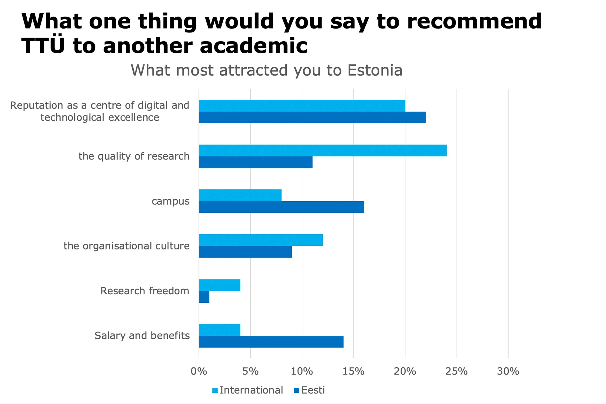
We did original research with International and Estonian academics and students
A new Name
This new name, TalTech, positions it as a 21stCentury institution, and will increase its appeal to the international communities of students, academics and research partners, positioning it as a European peer to leading technological universities.
Jaak Aaviksoo, Rector of TalTech University said "We already have a lot of foreign lecturers and students, our research teams have bright heads from around the world. In order to remain competitive and talent to continue to attract our university from home and beyond, it must be strong and prominent in international comparison. A powerful and distinctive name is only one small part of the whole identity and image, but still important.”

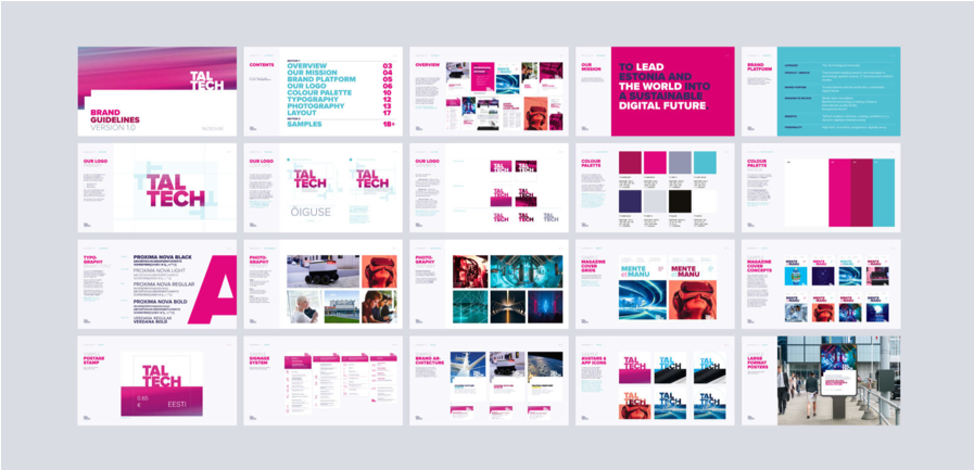
A new visual identity
Our design partners at L&CO then took this brief and decided to place the bold new name at the centre of their designs, creating a two line logotype that sits over or is filled with imagery. They enhanced the historic cherry red with a bolder colour palette and created a design framework that balances flexibility with consistency to enable the local agencies and in-house designers to implement the new identity across a myriad of applications.
A grand launch at the 100th anniversary celebration
The new brand identity was launched on 17th September and has drawn much favourable comment from the university’s community as well as the Estonian press.

Download the TalTech Press Release here